Tuesday, July 24, 2012

Planimetric Map (II)

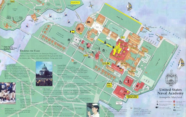
Although I have already posted a planimetric map, I wanted to post just one more.  The above map is a planimetric map of the Naval Academy in Annapolis, MD, where my little brother is currently undergoing plebe summer (a form of boot camp)!  You know the above map is a planimetric map because this map represents only the horizontal positions of features (without their elevations).
The map URL is: http://mappery.com/United-States-Naval-Academy-Map

GO NAVY, BEAT ARMY!! 


Unstandardized Choropleth Map

An unstandardized choropleth map is another thematic map that displays data sets with shading and coloring.  In an unstandardized choropleth map the data sets are shown as raw numbers. Instead of averaging the data, in an unstandardized choropleth map, it is represented as its original value.  The above map is an unstandardized choropleth map illustrating unemployment in the United States in the year 2008.  Using this map you can infer that the state of Michigan has the highest number of unemployed citizens.

Nominal Area Choropleth Map


The above map is a nominal area choropleth map.  As mentioned before a choropleth map uses differences in shading, coloring, or the placing of symbols within predefined areas to indicate the average values of a property or quantity in those areas.  Nominal scale: The differences in data are only of qualitative nature, for example: differences in gender, language, land use or geology.  The above nominal area choropleth map shows access to safe drinking water. 

Bilateral Graph


A bilateral graph is very similar to a bar graph or a histogram however it is, of course, bilateral.  Bilateral graphs compare two or more sets of data in a visual graph.  Sometimes bilateral graphs have multiple bars side by side and some bilateral graphs have bars that are opposite one another.  The bilateral graph seen above shows the bars side by side and is a bilateral graph of Disney open, high, low, and close prices.

Accumulative Line Graph or Lorenz Curve

The Lorenz curve is used an economics and is defined as graphical representation of the cumulative distribution function of the empirical probability distribution of wealth.  This means that it is a used to represent income distribution and therefore the inequality in wealth.  This graph is formed by plotting the cumulative distribution of the amount of the variable concerned against the cumulative frequency distribution of the individuals possessing the amount.  The Lorenz curve shown above illustrates the cumulative share of the income earned by people from lowest to highest incomes.

Index Value Plot


The easiest way to understand an index value plot is to first best understand what an index is.  In index is a statistical indicator or number derived from a formula, which is used to characterize a set of data.  An index value plot is a type of visualization map that is plotted on a line graph.  What an index value plot allows one to do is look at variations over a situation.   The above index value plot shows the rainfall recorded in inches in Oregon from 1999-2006.

Monday, July 23, 2012

Scatter Plot


A scatter plot is also known as a scattergraph.  A scatter plot is a mathematical graph of plotted points that show the relationship between two sets of data.  These points, or dots on the graph, show correlation between two variables.  As you can see from the above scatter plot the points on the graph show correlation between car weight and miles per gallon, something that can be very, very practical with today’s gas prices.
The map URL is: http://www.statmethods.net/graphs/scatterplot.html

Population Profile

A population profile is just as it sounds, a population profile.  It’s a chart that shows the number of people as a function of their ages in a given or specific location.  The above population profile illustrates the population distribution by age in the United States in 2007.  As you can see this population profile compares the ages of men and women in the US.

Climograph


A climograph is again a map used in meteorology.  A climograph is defined by a graph that depicts the annual cycle of temperature and rainfall for geographical locations. On the graph, one vertical access shows temperature, the second vertical access shows rainfall, and the horizontal access shows time.  This makes a climograph look like a bar graph with a line going trough or on top of it.  As you can see from the above climograph of beautiful Honolulu, Hawaii the top x axis (the line) shows temperature.  The bottom x axis (the bars) show the months. An the y axis shows the precipitation.

Windrose


A windrose is a meteorological diagram depicting the distribution of wind direction and speed at a location over a period of time.  These windroses are presented in a circular format and show the frequency of winds blowing from particular directions.  The lengths of each of the spokes in the windrose are related to these frequencies.  In the windrose each circle represents a different frequency, emanating from zero at the center to increasing frequencies at the outer circles.  Windroses are can quickly indicate the dominant wind directions and the direction of strongest wind speeds. The windrose seen above is for the city of Okeechobee, a city in Florida located 352 miles from Tallahassee, near Port St. Lucie.

Triangular Plot


A triangular (or ternary) plot is sound much more complicated than it actually is.  A triangular plot simply displays three variables or data sets in the shape of a triangle defined on horizontal and vertical axes.  The triangular plot seen above illustrates to plot the chemical analysis of igneous rocks.

Parallel Coordinate Graph


A parallel coordinate graph is a common way of visualizing high-dimensional geometry and analyzing multi-variable data.  In a parallel coordinate graph each variable in the data plot is represented as its own Y (vertical) Axis on the graph.  Each line drawn represents a single observation as it relates to each variable. Lines are drawn across each variable for each observation.  The Parallel Coordinate graph above illustrates six software implementation versions of greenhouse gas Global Warming Potential CO2 equivalency factors for the integration of radiative forcing over 100 years.  To accurately understand this parallel coordinate graph you would need the corresponding color legend (below).


Histogram


A histogram shows two sets of numerical data using bars of different heights.  In a histogram one set of data deals with a count of non-discrete numbers occurring (frequency). The other set involves continuous or presumed continuous numerical data (e.g. measurement of length, percentage, measurement of mass).  Although histograms look similar to what is known as bar charts, a histogram groups numbers into ranges, while in a bar chart each bar is a specific number.  In the above histogram you can see that the histogram does in fact group the numbers into ranges (as seen on the x axis).

Box Plot


A box plot or also known as a box and whisker plot (what we called it in elementary school) is a way of graphically depicting numerical data through their five number summaries.  Going from the Left to right the far left dot is the lower extreme, followed by the lower quartile.  The middle dot in the center of the box is the median.  Then comes the upper quartile and upper extreme.  The above is a simple and easily understood box plot. 

Stem and Leaf Plot


A stem and leaf plot is something that almost everyone was introduced to in elementary school.  A stem and leaf plot is a way to show quantitative data in a graphical format.  In a stem and leaf plot each data value is split into a "leaf" (usually the last digit) and a "stem" (the other digits).  The stem values are listed down, and the "leaf" values are listed next to them.  The above image shows a stem and leaf plot as well as how to place a number into a stem and leaf plot.

Similarity matrix


Another type of matrix is what is known as a similarity matrix.  As we learned below a correlation matrix has correlation values on ranging from -1 to 1.  In the similarity matrix, the similarity between two data points is shown and higher numbers are given to more similar points and lower or even negative scores are given for the more dissimilar points.  That means a difference between this similarity matrix and the correlation matrix is the values showing similarity.  Above is a similarity matrix and as you can see the similarity values range from -3.6 to 6 with -3.6 being the least similar and 6 being the most similar.

Correlation Matrix


A correlation matrix is simply a matrix giving the correlations, or relationship, between all pairs of data sets.  In a correlation matrix correlations have values on ranging from -1 to 1.  This means that 1 represents the greatest correlation, while -1 represents the least.  To read the correlation matrix you like up the row and column you want to compare.  The above map is a correlation matrix comparing lifestyles.

Star plots


Star plots are a completely new type of map.  A star plot is a method of displaying multivariate data, data involving two or more variable quantities.  Each star on a star plot represents a single observation.  This means each whisker or point on the star plot represents a dimension in the data set.  Typically, star plots are generated in a multi-plot format with many stars.  This star plot seen above is a different way to look at car statistics.  This is a very interesting idea, as I will soon be looking for a new car.

Unclassed Choropleth Maps


An unclassed choropleth map, as stated in the name is another type of choropleth map, a map that uses differences in shading, coloring, or the placing of symbols within predefined areas to indicate the average values of a property or quantity in those areas.  In an unclassed choropleth map a distinctive feature of unclassed choropleth maps is that each unique value has a unique shading of color and of course unclassed choropleth maps made it possible to create choropleth maps without classifying the data.  As you can see from the above map of the 2004 presidential election, the key is a gradient and specific numbers do not have specific colors, hence this is an unclassed choropleth map.

Classed Choropleth Maps


Although earlier I presented just plain choropleth maps, we are now taking a look at a specific type of choropleth map, the classed choropleth maps.  Classed choropleth maps are of course choropleth maps, these maps display data through a color visualization method.  Each color on a classes choropleth map represents a range of data rather than a specific number.  As seen in the classed choropleth map above, you can easily see the states with the greatest population over 65 years of age in 1990 as collected by the Censes Bureau.  As you can see from the map and the key, each color represents a percent range.

Range Graded Proportional Circle Map


Range graded proportional circle map, not to be confused with the below continuously variable proportional circle map although they are quite similar.  In range graded proportional circle maps the data is divided into groups.  Then, the mapmaker, or cartographer, chooses circle sizes for adjacent class so that the reader of the map can easily see the difference in circle sizes.  The map seen above is a range graded proportional circle map of the population of Chicago with German ancestry in 1990.

Continuously Variable Proportional Circle Map


A continuously variable proportional circle map is a proportional circle map which utilizes circles to create point data, rather than just dots.  The circle area is in direct correlation to the measured variable and data portrayed in the map.  This means that the area of the circles on the map do not always correlate with the area or place shown on the map.  There is no limit on the number or sizes of circles used in these maps.  The map shown above is a continuously variable proportional circle map that shows the motor vehicle deaths in the state of California by county for an unknown year.

DOQQ


DOQQ stands for Digital Orthophoto Quadrangle.  A DOQQ generally shows an aerial photo with UTM coordinates overlain.  UTM coordinates are a grid-based method of specifying locations on the surface of the Earth.  The DOQQ maps are normally either black-and-white or color infrared, like the infrared aerial photos.  These DOQQ aerial photos are one-fourth of the U.S. Geological Survey's 7.5-minute quadrangle. The above image is a DOQQ map of Lake Kahola, a small water supply and recreational lake located in the Flint Hills of east-central Kansas.

DEM


 A DEM map is what is known as a digital elevation model.  These DEM maps allow the people looking at them to visualize the elevation of the land.  These DEM maps only represent height information without any further definition about the surface.  This means that from these DEM maps you learn nothing about what is on the land such as houses or roads, rather just the elevation of the land.  The above DEM map is of the Great Barrier Reef, the Coral Sea, and the neighboring Queensland coastline, one of the many, many places I dream to scuba dive before I die.

DLG


A DLG map, also known as a digital line graph map is a digital visualization of geographic area.  Digital line graph maps show features such as roads, state and county boundaries, streams and other standing water, and elevation contour lines.  DLG maps can be used to in geographic information systems, as well as for automated spatial analyses.  This means that exact longitude and latitude can be identifies at any point on the map.  The DLG map above is showing the bodies of water and roads near Springfield, Ohio.

DRG


A DRG map, or digital raster graphic map is a scanned image of a United States Geological Survey (USGS) standard series topographic map.  This was a way of converting topographic maps into raster format, and these DRG maps cover nearly the entire United States.  DRGs can be ordered from the USGS for $1 per file, or a scaled-down version can be browsed online.  The map above is a DRG map of a common landmark known in Tallahassee, Lake Ella.  In this DRG map you not only see the lake, but also Raa Middle School (called Raa Jr. High School on the map) and other city parks.

Isopleths


Isopleths are very similar to the contouring lines found on a contour map, and are therefore found also on isoline maps like isohyets and isotachs .  Isopleths are lines on a map or diagram connecting points for which a chosen quantity has the same value.  Isopleths are often found is geography and earth science.  The above map shows isopleths of snowfall for Deep South Texas and the Lower Rio Grande Valley.

LIDAR


LIDAR is something that was new to me until this class.  LIDAR (Light Detection And Ranging) is a detection system that works on the principle of radar, but uses light from a laser. LIDAR is an optical remote sensing technology that can measure the distance to, or other properties of a target.  LIDAR is often used in agriculture, archaeology, biology, conservation, geology, meteorology, law enforcement, the military, and many more.  The above image is of LIDAR data from a company that converts raw LIDAR data into detailed urban feature data to support analysis and mission planning.

Doppler Radar


Doppler radar is something that almost everyone is familiar with.  Doppler radar is a radar tracking system using the Doppler effect to determine the location and velocity of a storm, clouds, precipitation, or wind.  The above picture is the Doppler radar of Annapolis, Maryland where my brother is currently doing plebe summer at the Naval Academy.  From this map you can see where the rainstorms are located.

Black & White Aerial Photo


A black and white aerial photo is very similar to the below image of the infrared aerial photo, although instead of having an red tint the aerial photo is black and white.  Black and white aerial photos are used in both high- and low-altitude aerial photography.  These photos are used to more easily obtain information about an area that may not be able to be understood from the ground.  The above photo is a black and white aerial photo of downtown Atlanta, one of my favorite cities in 1958. From this photo it is very easy to see the basic layout of the city, something that on the ground would take many hours.

Infrared Aerial Photo


An infrared aerial photo looks very similar to the view of the ground that you might see on an airplane flight.  Infrared aerial photos can be used to document changes in the environment.  Aerial photos are also often used to monitor things such as damage after a storm, health of forests, the monitoring of wetlands and bays, or looking at sites contaminated by toxic chemicals from a safe and healthy distance.  The above image is an infrared aerial photo taken in June of 2010 of the BP oil spill that affected the Gulf of Mexico and much of the businesses along the Gulf in Florida, and Alabama.

Cartographic Animations


When you think cartographic animation, often times nothing comes to mind.  However, cartographic animation is more popular and more prevalent in our daily lives than many people think.  Think the weather channel and the way that they show you a moving Doppler radar.  This is an example of a cartographic animation.  Cartographic animations allow spatial visualization, and the depiction of change and movement across land over time.  The above map is a cartographic animation of Hurricane Irene, the fifth costliest United States hurricane that affected the Eastern United States in 2011.

Statistical Map


A statistical map is a broad group of maps.  As can be inferred by the name, statistical maps are used to show certain factors and statistical data over an area.  These areas can be broad like a large country or smaller like a capital city.  The above map is a world map of maritime territories, coastal waters that are not Territorial Waters.

Cartogram


A cartogram is a map in which some thematic mapping variable – such as travel time or Gross National Product – is substituted for land area or distance.  This means that is it is value by area map.  These not only show travel time or gross national product, but also population or distance.  The above cartogram looks as though it could be in an art museum, which is why I love it.  However, this above map is a cartogram with each county rescaled in proportion to its population. Then the map goes even deeper and the colors refer to the results of the 2004 United States presidential election popular vote.  As you can see south Florida is shown much larger than it actually is due to its large population.

Sunday, July 22, 2012

Flow maps


A flow map is a mix of a flow chart and a map, hence the name flow maps.  Flow charts are types of diagrams that show processes as steps found in boxes and linked by arrows so that the process or algorithm is easy to follow.  A flow map is used to show movement or steps just like a flow chart does, however these movements or steps are shown on a map.  Flow maps often show movement of people, weather, natural resources, or products.  The above map is not very descriptive but is an easily understood example of a flow map.  This flow map is showing proposed 2006 satellite office locations for an unknown company.

Isopach


This map is also an isoline map, however it is not depicting a term found in meteorology, but rather a term found in geology. An isopach map is a map illustrating variation of thickness within a tabular unit or stratum.  This meant nothing to me, and actually confused me until I learned that these is terms are used in sedimentology and geology.  The above map is an isopach map of the Houston and Rio Grande slope basins.  My God Father works in oil in Houston, TX so this map reminded me of him.