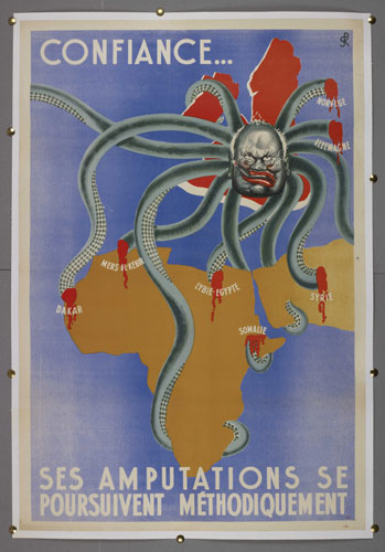
The above map is an example of a Propaganda map. This is a map that we are all probably
more familiar with as we have seen these in our many social studies and history
classes throughout the years.
Propaganda maps are simply what they sound like they are,
propaganda. Often times Propaganda
maps are political cartoons as the one seen above. Propaganda maps are meant to sway people of a certain area,
beliefs, or a way of living in a specific way, often times into believing
something that is not true. The
above picture is a Nazi poster, produced in France in 1944, portrays Churchill
as a demonic, cigar-smoking octopus, whose attempts to seize Africa and the
Middle East are being thwarted by the Axis forces that cut his tentacles so
that they bleed profusely.

No comments:
Post a Comment
Note: Only a member of this blog may post a comment.